A widget is one of the objects that you can insert into a form component in order to display data in a particular way. Examples of different widgets are an editbox, checkbox, radiogroup and dropdownlist. Each one of these widgets has its own properties, and each installation will have default values for these properties defined in the [widgets] section of the USYS.INI file, as shown in the following:
[widgets]
; Logical to physical widget mapping
EditBox=ueditbox(font=editfont;autoselect=on)
CommandButton=ucmdbutton(tooltip=on;font=buttonfont)
DropDownList=udropdownlist(font=listfont;forcefit=on)
Combobox=ucombobox(font=listfont)
CheckBox=ucheckbox(font=label)
RadioGroup=uradiogroup(font=label)
Map=umap(font=label)
ListBox=ulistbox(font=listfont)
SpinButton=uspinbutton(font=editfont;autoselect=on)
Picture=upicture
OleContainer=uOleContainer
OcxContainer=uOcxContainer
DragSource=udragdrop(source=on;label=on;sourcefeedback=icon)
DropTarget=udragdrop(target=on;label=on;targetfeedback=copy,move;targethilite=halftone)
Slider=uslider
Meter=umeter
Tree=utree
Tab=utab
These entries will appear in the list of widget types in the field properties dialog box.
This is not a new type of widget, but rather an alias name for a standard widget which has different settings for its properties. The idea is that instead of using the standard widget and changing its properties in your form you can create a custom widget with those properties already set. When you use that custom widget in your form it will automatically inherit those properties from your INI file.
There may be times when you want to vary the way in which a widget is displayed, but not all instances of that widget. For example, suppose the user wants an editable field and a non-editable field to have a different look on the screen. They both start off as instances of the EditBox widget, but with different properties. Once you have decided what properties can be changed to obtain the required look you can create a custom widget with those properties set. Consider the following two entries in the INI file:
EditBox=ueditbox(font=editfont;autoselect=on)
NoEditBox=ueditbox(font=noeditfont;3d=off)
They produce the effect which is shown in figure 1:
Figure 1 - EditBox and NoEditBox

Note that as well as having 3d=off the NoEditBox widget also uses a different font. Font definitions can be found in the [screen] section of the INI file.
Figure 2 - CommandButton and ColumnButton

Figure 2 shows two different types of the CommandButton widget. One has the text centered, the other has it aligned on the left. This is achieved with the following entries in the INI file:
CommandButton=ucmdbutton(font=buttonfont;tooltip=on;halign=center;valign=center)
ColumnButton=ucmdbutton(font=label;halign=left)
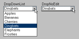
Figure 3 - DropDownList and DropNoEdit

Figure 3 shows two variations of the DropDownList widget. One shows the full array of available entries and allows the user to make changes while the other does not. This is achieved with the following entries in the INI file:
DropDownList=udropdownlist(font=dropdown;3d=on;forcefit=on;dynamic=on))
DropNoEdit=udropdownlist(font=dropnoedit;3d=off;entries=0;forcefit=on;dynamic=on;autoselect=off)
By using a custom widget for different circumstances and ensuring that your developers use the right widgets in their forms it becomes easy to make global changes - simply change the settings in your INI file and run your application. The alternative would be to go through each of your forms and change the properties for each widget manually, then recompile your forms. Which do you think is easier?
To find a list of properties that can be specified for each widget type use the online help as follows:
Tony Marston
8th July 2002
mailto:tony@tonymarston.net
mailto:TonyMarston@hotmail.com
http://www.tonymarston.net